Community Update #67
|
Posted 2022-11-12 12:59:58
|
Ruru #61244 |
|
Posted 2022-11-12 13:29:33
|
Caramel #106183 |
|
Posted 2022-11-12 14:28:19
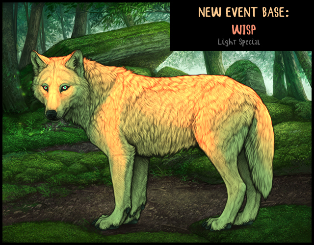
orderup said: "There has not been a *single* special light base that has not felt low in pattern and incredibly, ridiculously, kind of uncomfortably oversaturated." Ruru said: "Wisp is EYE STABBING with how bright it is" I think light bases are challenging to design in a way that looks good and also stands out. On one end of the spectrum, there's opal, which imo looks good at 0 markings. It's got a subtle iridescent blue and pink which is really pretty. But because it's so subtle, it gets covered up by markings really easily. You put on a few markings and you can hardly see the patterns of the original base; you might as well have a glaucous wolf. On the other end of the spectrum, there's bases like selene, turquoise, and tombac. I like all three colors quite a bit (turquoise smoke and selene ornate spots are among my favorite marks) but there's no denying at 0 markings they have a distinct neon eyeburner vibe. Which is not everyone's vibe. But it also means you can mark them heavily (e.g. for a stud) and the selene/turq/tombac base can still shine through, which is in my opinion a plus. |
 Lionel #34199 |
|
Posted 2022-11-12 17:16:32
  You are loosing a bit of dynamicism, the hints of extremely saturated red/orange in the fur texture no longer stands out, but I still think the desaturated one looks miles better than the actual base. And we have a great art team so adding back hints of other color that is actually pleasing to look at should be doable. Turquoise and wisp both look like they've been deepfried (I don't think selene is nearly as bad in this regard as either of those, although it definitely should be mentioned alongside tombac). |
boo #7967 |
|
Posted 2022-11-12 23:46:01
|
Momogold #71156 |
|
Posted 2022-11-14 22:01:12
|
 🌵NIB Brachy Breeder🌵 #5084 |