[Custom Decor] Custom Decor System Needs Reform
|
Posted 2024-08-30 05:44:51
|
 canaridante #129558 |
|
Posted 2024-08-30 05:54:00

|
 ☠Nevaneel 1#CoolGuy Fan💞 #119024 |
|
Posted 2024-08-30 08:10:13
|
 Shunkana #110039 |
|
Posted 2024-08-30 10:12:19

|
mercurie #35270 |
|
Posted 2024-09-09 10:53:07 (edited)
Clearly either some cd judges (or whatever they're called) are significantly more strict/lenient than other cd judges (which is something that the higher ups will need to go out of their way to correct), or the standards for cds are just so vague that not even their own cd judges can actually tell was does and doesn't fit Wolvden's style. Edit: Also want to add that the feedback I received is very vague and unhelpful, especially since my decor is stage-specific. On which pose is the lineart too thick? Do I have to redo all of them or do I only need to redo the lineart for the cd on this specific stage? And because the critique is only given via a game notification, there's no way for me to reliably ask for any clarification, or ask if the changes I make are any good, without having to resumbit and wait who knows how long for a reply. |
🌌⭐Lilith🌃🌙 #98063 |
|
Posted 2024-09-15 19:15:46 (edited)
It's not easy to give so much personal time to every rejection. When it comes back more than once or it's hard to convey the message, I am now trying to provide visual pointers - thanks to having extra artists doing work on Lioden which we hired this spring, I can give more time to CD's as the person who overviews. It's not always possible. Sometimes the CD's wait for my opinion a bit, specially when deadlines approach. They're not done in order and won't be - they are done in order that is easiest on the team, as they prepare feedback or review on multiple screens. Most common issue is decors being extremly sharp/pixelated because many tablets blur the screen. This is also an issue when the team uses tablets to review as not always PC is available and some pixelated CD's might pass. It's really hard to control this unless I dedicate and overview every single CD which is just not possible, there's dozens every day, on both games. I talked to the CD teamforce this month because I also noticed some CD reviews got a bit vague and I said, wow as an artist I have no idea what to do to do what you said, and gave a lot of corrections and pointers. I am now also a bit more available for visual pointers - but again, in circumstances where words seem to not be enough. I want to make it better - it will take time. No clue if I can ever mark this as "Approved" etc because this is a process and humans aren't machines, the feedback will be always as helpful as the person handling it can word it. Hopefully with my refreshed direction it will get better. As for tutorial - we'll work on a new one, can you refresh in your suggestion exactly what you want it to contain? I cannot change how you respond to the tickets. Please don't be afraid to open a ticket to ask details regarding rejection - I will be personally informed by my assistant you need a response. oop, one more thing - I do allow SOME pixelation, as long as it has like less than 10% area, and it's not affecting most important details.
|
|
|
Posted 2024-09-15 20:03:55
I saw the paint-over reviews a few times now for other users and I was amazed by them from the very beginning! It's a great change and it's great to see you guys working on these things and trying to improve them Some suggestions from me when it comes to the art style tutorial, because those are things I either see many people struggle with then it comes to CD, or they made me personally unsure on how to approach them:
On a side note - you mentioned opening a ticket. Does that mean we are allowed to open Modbox tickets about custom decors from now on? We were told we cannot, that's why I wanted to double check 
|
canaridante #129558 |
|
Posted 2024-09-15 20:42:10
What is the thickness we should be shooting for? I see some CDs with much thicker lineart than others, and some CDs that don't have lineart at all, or it's so thin/transparent you can't even see it. When is it acceptable to use colored lineart? Some artists seem to get away with colored lineart while others are repeatedly told that the only acceptable lineart color is black. How do we tell what level of pixelation is acceptable versus what is "too sharp"? Artists who have used the exact same technique for multiple pieces sometimes get a random rejection for lineart pixelation despite it being done the same way as their approved decors. Just a little list to start us off. It's nice to see this thread being acknowledged. |
Shunkana #110039 |
|
Posted 2024-09-16 10:43:43 (edited)
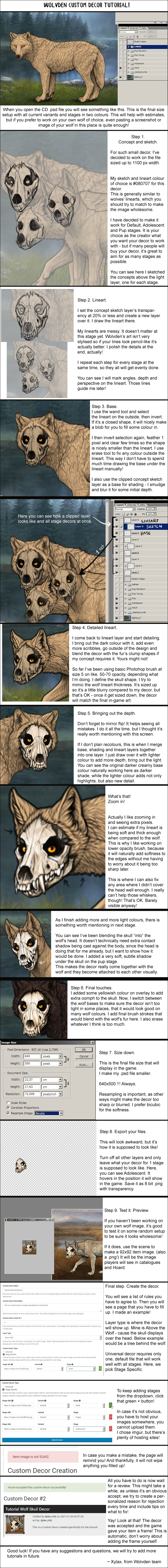
Firstly I want to thank you from the bottom of my heart for addressing this thread. I've been waiting almost 2 years for this to be acknowledged and I'm absolutely over the moon that it finally has been! It really sounds like you're dedicated to making some improvements with the team and that will make CD-life easier for everyone. A couple points... 1. Regarding your question about the tutorial. I just pulled up the image tutorial (link) and I have some thoughts. In my opinion it's generally pretty vague and confusing, and the method shown is quite messy/loose and therefore not particularly coherent or replicable, especially not for a beginner. It took me years to develop my method -- one photo tutorial could never do it justice. I just don't think it's anywhere near detailed enough. I think a video tutorial would be much more effective, but only if the method shown is streamlined and several points are expounded upon. Maybe there could even be a separate tutorial for bodypaint, since bodypaint methods are pretty different from regular CD methods. The existing tutorial does not go into nearly enough detail about what is expected for lineart. The color, size, thickness, softness vs pixelation, all need to be addressed with much more detail. This is necessary in my opinion since there seems to be a ton of rejections due to lineart issues and it's clear no one really knows what the standard is, especially when we get some decors approved which have no lineart at all like this one or this one. (Disclaimer: I think both of these decors are very cute and I'm not trying to "call out" anyone -- I'm just trying to pull up specific examples to help explain the issue I'm trying to describe here.) Yet I submitted this one and it was rejected for the lineart being too thin... So that is very confusing for everyone. I understand that going into more detail about lineart requirements in the tutorial won't completely fix the issue because of the monitor/screen issues you mentioned, but it should go a long way. Also, I've tested the double canvas size theory, and it's my opinion that if you work on a double size canvas, everything is going to take twice as long because you'll be putting twice as much detail into it, then shrinking it & mourning the loss of most of those details you spent so long rendering, and then having to re-work the lineart yet again because shrinking it inevitably crunches and pixelates the lineart. So I would personally never recommend this method. In fact I suspect recommending this method to people is the source of a lot of pixelated lineart issues. After having tried both methods several times, I think it's much more straightforward to just work on the standard 640x500 canvas. I think it would make more sense to do a simpler object for the tutorial, like an apple or a pair of antlers or something. I feel like the skull mask isn't the best example to use for the tutorial. These are just several thoughts on how to add more detail to the tutorial and make the tutorial easier to follow. Again, I think a video tutorial would be infinitely more useful than the current tutorial. 2. Sorry but I'm not exactly sure what "I cannot change how you respond to the tickets" means. I've opened up numerous ModBox tickets about CD rejection issues in the past but was told in July 2023 not to do that anymore because they have nothing to do with custom decors. Is this still the case? I would love some clarity about whether or not we can ModBox as I've been told directly that we cannot. I can't post that ticket here because of CoC rules, but Xylax, if you would like I can personally message you a link to the ModBox ticket where I was told not to contact them anymore about CD things. I hope that my passion for this game and making custom decors is clear by now. I'm more than happy to help with any other questions or clarifications you may need, whether it be here or via private messages. Thank you again for addressing this, it's always been my goal to make the CD system better and easier for everyone to navigate. ETA: Another major issue is the inconsistency with the rules. Just one example off the top of my head, this decor and this decor were approved, but when I made my slot machine decor I was forced to remove the Gold Cones and Guarana falling out of the machine (again, I can provide the link to that Modbox privately if needed). Therefore it is my opinion that the CD rules absolutely need to be reassessed, as well as a reassessment of how much or how little the team is observing & applying those rules. |
mercurie #35270 |
|
Posted 2024-09-16 17:36:05
After the flood threat, I will dedicate extra hours in October to sit down and redo tutorial and see what can be done to make you all feel more comfortable in CD process. I know it's not the best to have a rejection, and I want to avoid massive text walls when submitting CD's and learning about them as well. Will get back to you in October <3 |
 #4 |